


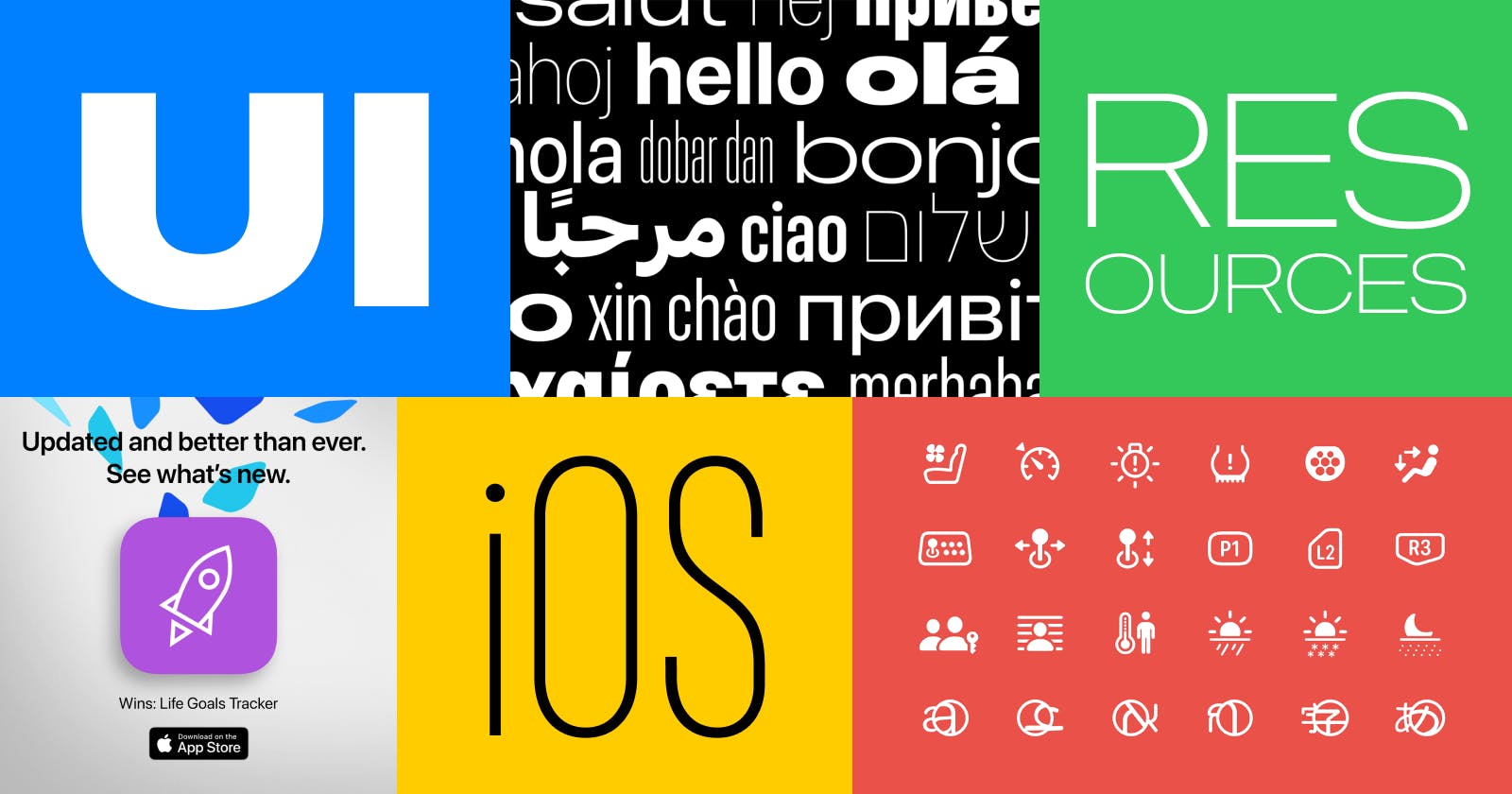
In this article, I would like to share with you a list of UI resources I am using during my work on my iOS apps. There are so many resources that can help you with UI and UX design and with the promotion of your apps. But something I prefer is to keep my toolbox simple and use the minimum amount of tools and resources to make the job done as fast and easiest as possible.
That being said, if you use something else in your workflow and would like to share this with me, please leave a comment. I would love to know.
Human Interface Guidelines
Link: https://developer.apple.com/design/human-interface-guidelines
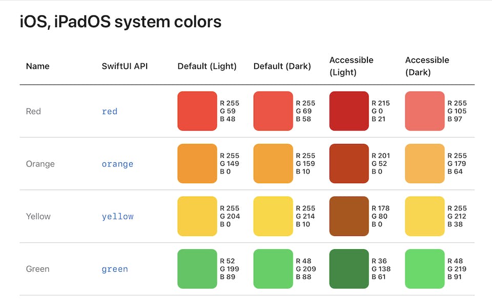
This is one of the best places to learn about UI and UX design for Apple platforms. You will learn the basics and read about best practices and design patterns. If you are just starting or if you are a more experienced designer, this should be a place where you go to improve and update your design knowledge.
I recommend you read the whole documentation. But if needed, you can also search for specific topics. For example, "Color" alone is a long article about best practices, inclusive color, system colors, color management (with an example of sRGB vs Display P3 color spaces) and more. Also with color palette and RGB values for different variants of each color.
Fonts
Fonts for Apple platforms
Link: https://developer.apple.com/fonts/
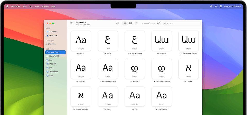
Here you can learn more about Apple's default fonts and download font packages.
Maybe you already know this, but... The default system fonts on Apple platforms are San Francisco and New York (most apps from Apple use San Francisco). These fonts come with Apple's OSes and you don't need to do anything for your devices to display them properly in the apps you are using. However, if you want to design with these fonts and be able to use them in your design tools, you need to download the fonts from Apple.
It's all on the website I mentioned, but I want to emphasize this: SF Compact is the system font for watchOS. And SF Arabic, SF Armenian, SF Georgian and SF Hebrew are separate font packages if you need them.
Also, another important thing: you only need to download these fonts for design purposes. No need to embed them in your apps developed with Xcode.
Google Fonts
Link: https://fonts.google.com
There are many websites with fonts. Google Fonts is just an example. I chose it for a few reasons:
It's a big library of FREE fonts.
The filters are very good, so you can easily check if the font supports the language or group of languages you need.
Google Fonts are very popular in web design. Very often you will also have a website about your app, so you could potentially use the same fonts in your app and on the website.
But... I would like to give you one piece of advice here. Try to use Apple's fonts first and go for other fonts only if you really need them (font as an important part of your brand, etc.). This will make your life easier. With Apple's fonts, you don't need to embed fonts in your app. You don't need to define custom font styles. And you don't need to worry about localization. With custom fonts (Google Fonts or any other fonts than San Francisco and New York) you need to take care of this by yourself. If you need custom fonts - plan ahead and choose fonts with support for all the languages you might need later.
Icons
SF Symbols
Link: https://developer.apple.com/sf-symbols/
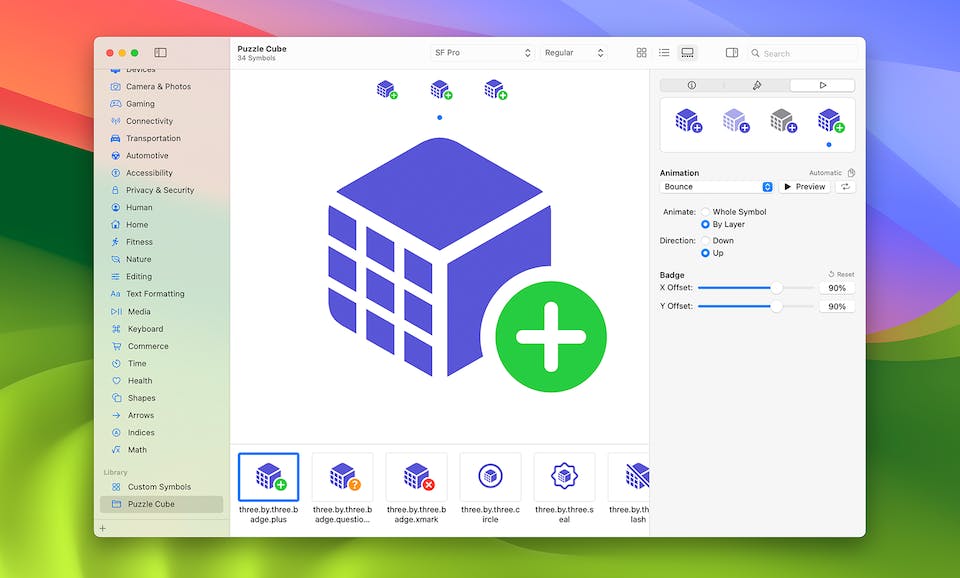
I recommend you start with this: official icons from Apple. Used in every OS from Apple. Very easy to use in SwiftUI. If you need some custom icons, there's an easy way to make your own SF Symbols.
Using SF Symbols is not only easy, but it also helps with improving the UX of your apps. If you are using the same icons as in other apps (and also in native iOS apps), users will be familiar with them. They will recognize them faster.
FontAwesome
link: https://fontawesome.com
There are many other icon libraries, but I would like to show you FontAwesome icon library as an example. They have many icons in the catalog and many styles to choose from.
I really like and recommend these icons, but... I mostly use them for web design and web development. So while there are other options than the icons from Apple, personally, for my iOS apps, I like to use default SF Symbols and design my custom SF Symbols if necessary.
Component Libraries
Sketch Libraries
Link: https://developer.apple.com/design/resources/
Apple's official design resources for Sketch and a few other tools: Adobe XD, Photoshop and some resources for Apple's Keynote.
For your convenience, here are some direct links to a few most popular resources:
iOS and iPadOS: https://developer.apple.com/design/resources/#ios-apps
macOS: https://developer.apple.com/design/resources/#macos-apps
visionOS: https://developer.apple.com/design/resources/#visionos-apps
Licensing and Trademarks: https://developer.apple.com/licensing-trademarks/
Wait! But what about Figma?
iOS UI kit in Figma
Link: https://www.figma.com/community/file/1121065701252736567
This is just one example. iOS 16 UI Kit for Figma by Joey Banks. One of the best and most popular iOS design kits for Figma.
For a few years, Figma users were relying on such libraries made by the Figma community. It is also possible to import Sketch files to Figma (including Apple's Sketch libraries), but Figma design kits were just easier and better.
However, we now also have...
Apple's design library for Figma
Link: https://www.figma.com/community/file/1248375255495415511

During WWDC 2023 Apple finally released their official iOS and iPadOS Design Library for Figma. Great news for every Figma user designing for iOS.
But that's not all. We also have a few other libraries from Apple:
macOS Design Library
Link: https://www.figma.com/community/file/1251588934545918753
visionOS Design Library
Link: https://www.figma.com/community/file/1253443272911187215
App Icon Production Templates
Link: https://www.figma.com/community/file/1250144691121363237
App Screenshots
When we want to publish our app on the App Store, we need not only the app, metadata (app name, description, etc.) but also app screenshots.
Screenshot specifications
Link: https://developer.apple.com/help/app-store-connect/reference/screenshot-specifications
Let's start with Apple's screenshot specifications. Very detailed, but in my opinion also a bit confusing. After you'll read the Requirement for each screenshot size, you will realize that you don't need most of the sizes. At the time of writing this article, the minimal set of screenshots you need for an iPhone app is:
iPhone 6.5" (for example, iPhone 14 Plus)
iPhone 5.5" (for example, iPhone 8 Plus)
Apple's Product Bezels
Link: https://developer.apple.com/design/resources/#product-bezels
Here you will find the latest product bezels from Apple. Latest iPhones, iPads, Macs, and even Apple Watches and Apple TV. With those, you can create screenshots like in the image below - app screenshots on the iPhone screen with some promo texts.

However, as I previously said, we still need to provide screenshots for iPhone 5.5" (for example, iPhone 8 Plus). And while it's not a requirement to use iPhone 8 Plus bezels on those screenshots, this is something I am doing. If you want to do the same, you will find out that iPhone 8 Plus is not included in the official Apple Product Bezels. But...
Meta's Product Bezels
Link: https://design.facebook.com/toolsandresources/devices/
Thankfully, Meta's Design Team comes to the rescue. Their library is quite big. They have bezels of products from many brands and luckily for us, they also have Apple's iPhones, including iPhone 8 Plus.
Marketing
OK. Your app is ready. Your screenshots are ready. It's time to publish your app on the App Store and tell the world about it. It's time for some marketing and with Apple's resources, promoting our app is a bit easier.
Marketing Resources and Identity Guidelines
Link: https://developer.apple.com/app-store/marketing/guidelines/
Here you can learn a lot about Apple's recommendations. Few nice examples of what you can and shouldn't do with your marketing images.
App Store Marketing Tools
Link: https://tools.applemediaservices.com/app-store/
Find your app first and you will be directed to a page with marketing tools for your app, where you can generate a Short Link for your app, download App Icon, get "Download on the App Store" badges and even generate a QR code with a link to your app on the App Store.
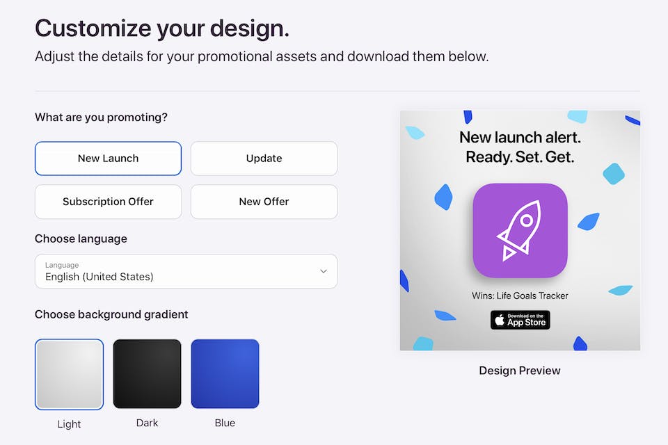
Promote like a pro
Link: https://tools.applemediaservices.com/apple-app-store-promote
Again, start with finding your app. You will be redirected to a page with a wizard to generate nice-looking promo images for your app. Few different texts, a few color variations and a few different sizes to choose from.
THE END
Thank you for reading. I hope that you found this article useful and maybe learned a thing or two about UI design.
If you want to support my work, please like, comment, share the article and most importantly...
📱Check out my apps on the App Store:
https://apps.apple.com/developer/next-planet/id1495155532