1 button away from better UX
2 examples how you can identify your users' needs
👨🏻💻 UX Designer, self-employed at NEXT PLANET - small design studio. 👨🏻💻 Indie iOS developer 📱 Creator of: Moons, Numi, Skoro, Wins and Emo. 🎸Guitarist at ZERO and Quadroom 🎨 MA in art 🌱 Vegan
Sometimes adding 1 button can improve the User Experience of your app. But how to know which button? 🙃 That's where UX research comes to play.
As my friend Mateusz Jedraszczyk likes to say, User Experience without users is just some experience. Or in other words, there's no User Experience without users. UX design should always be an answer to people's needs. You can't just design new screens and user flows in isolation from users. You need to know what they need and what problems they have.
Two things I did to identify what changes I need to implement in my iOS app Numi:
1. Usability Tests.
I conducted them a few weeks ago with a few people. Remotely, using the FaceTime app.
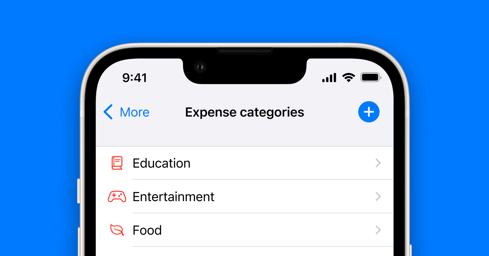
Numi is an app for managing personal finances, in which you can record your income and expenses. And few of the testers told me that they want to be able to add new categories while adding transactions.
OK, so I knew it is one of the things I need to improve.
2. Direct Feedback from users.
My app has an implemented email link. This means that users can contact me directly by sending me an email from the app. And a few days ago one of my users did. He described how annoying it is to close Add Transaction screen, go to Settings, add New Category, and go back to Add Transaction again. Especially now, when he's new to Numi and didn't set up all his categories yet.
Now I knew. The ability to add new categories on the Add Transaction screen is not just one of the features I should add. It's one of the most important features I need to add. One cool thing is that it's also not something difficult to implement :)
And here it is, the current and the upcoming version of my iOS app Numi.
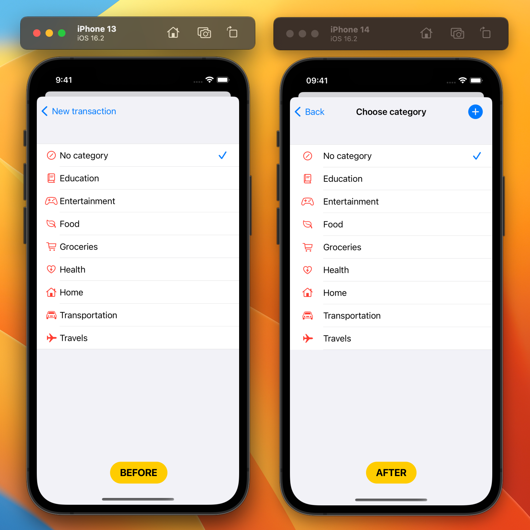
The main difference is added + button. Soon users will be able to add new categories not only from Settings but also on Add Transaction and Edit Transaction screens.
📱Link to Numi on the App Store:
https://apps.apple.com/app/id1636232810
Thank you for reading!
☕ If you like what I do, consider supporting me on Ko-fi! Every little bit means the world!
https://ko-fi.com/kslazinski
