👨🏻💻 UX Designer, self-employed at NEXT PLANET - small design studio. 👨🏻💻 Indie iOS developer 📱 Creator of: Moons, Numi, Skoro, Wins and Emo. 🎸Guitarist at ZERO and Quadroom 🎨 MA in art 🌱 Vegan
Let's see how to make outlined TabItem icons in iOS. And let's look at this problem from a few different perspectives: development, UX and UI design and accessibility.
Regular Tabs
The easiest and fastest way to add tab navigation to your SwiftUI app is to use TabView and SF Symbols from Apple.
When I'm writing this article, the current version of SF Symbols is 4. And it consists of 4,400 symbols. Many of them have 2 variants: regular (outlined) and filled. Please have a look at the pie chart example and notice differences in the icon and the name.

In SwiftUI, we use these icons like this:
Image(systemName: "chart.pie")
Image(systemName: "chart.pie.fill")
Here's an example of the TabView with 4 tabs using SF Symbols icons:
TabView {
    TransactionsView()
        .tabItem {
            Label {
                Text("Transactions")
            } icon: {
                Image(systemName: "arrow.left.arrow.right.square")
            }
        }
        .tag("transactions")

    RecurringView()
        .tabItem {
            Label {
                Text("Recurring")
            } icon: {
                Image(systemName: "arrow.clockwise.circle")
            }
        }
        .tag("recurring")

    SummaryView()
        .tabItem {
            Label {
                Text("Summary")
            } icon: {
                Image(systemName: "chart.pie")
            }
        }
        .tag("summary")

    MoreView()
        .tabItem {
            Label {
                Text("More")
            } icon: {
                Image(systemName: "ellipsis.circle")
            }
        }
        .tag("more")
}
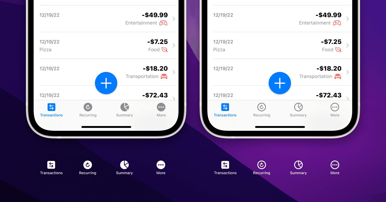
With this code we will get this tab navigation:

Did you notice something strange? In my code, I used regular variants of the icons, but in the app, they are filled. And this is a...
Default SwiftUI behavior
Since iOS 15 it just works this way. Apple decided to render TabItem icons as filled on iOS and outlined on iPadOS and macOS. The same code will result in a little different look on each platform.
Let's see how the same icons in Apple's Developer app look on iOS, iPadOS and macOS:


It's part of Apple's design and you can read more about Tab bars in Human Interface Guidelines here:
https://developer.apple.com/design/human-interface-guidelines/components/navigation-and-search/tab-bars/
And also about Icons here:
https://developer.apple.com/design/human-interface-guidelines/foundations/icons
Outlined tabs in iOS
But what if we want to have outlined icons in the tab navigation in iOS for some reason? The good news is that it is quite easy to do. We can add this one line of code to each Label in our TabView to tell SwiftUI not to change variants of our icons:
.environment(\.symbolVariants, .none)
Now let's add one variable in our view:
@State private var selectedTab = "transactions"
And let's use a ternary operator in our code like this:
Image(systemName: (self.selectedTab == "summary") ? "chart.pie.fill" : "chart.pie")
If you are not familiar with ternary operator syntax, this basically means:
If selectedTab is equal to "summary", use the chart.pie.fill icon. If not, use the chart.pie icon.
Let's see how the whole TabView code would look like with these changes:
TabView(selection: $selectedTab) {

    TransactionsView()
        .tabItem {
            Label {
                Text("Transactions", comment: "Tab view navigation item.")
            } icon: {
                Image(systemName: (self.selectedTab == "transactions") ? "arrow.left.arrow.right.square.fill" : "arrow.left.arrow.right.square")
            }
            .environment(\.symbolVariants, .none)
        }
        .tag("transactions")

    RecurringView()
        .tabItem {
            Label {
                Text("Recurring", comment: "Tab view navigation item.")
            } icon: {
                Image(systemName: (self.selectedTab == "recurring") ? "arrow.clockwise.circle.fill" : "arrow.clockwise.circle")
            }
            .environment(\.symbolVariants, .none)
        }
        .tag("recurring")

    SummaryView()
        .tabItem {
            Label {
                Text("Summary", comment: "Tab view navigation item.")
            } icon: {
                Image(systemName: (self.selectedTab == "summary") ? "chart.pie.fill" : "chart.pie")
            }
            .environment(\.symbolVariants, .none)
        }
        .tag("summary")

    MoreView()
        .tabItem {
            Label {
                Text("More", comment: "Tab view navigation item.")
            } icon: {
                Image(systemName: (self.selectedTab == "more") ? "ellipsis.circle.fill" : "ellipsis.circle")
            }
            .environment(\.symbolVariants, .none)
        }
        .tag("more")

}
This way selected tab will have a filled icon variant and other tabs will have a regular, outlined icon.

Accessibility
If you know anything about accessibility, at this point you may wonder: Is it better to override default iOS behavior and use the fill icon for the selected tab item and outlined variant for all the other tabs? And the answer is: Yes and No 🙃
In general, relying on only one thing to distinguish some items is not a good idea. In our case, this one thing would be color, if all the icons would be filled. The active tab item is blue. Other tab items are grey. Users with colorblindness might see all of them as grey. And it wouldn't be clear to them which tab is active. So it's good to mix outlined and filled icons, right? Right!
But... Apple does a great job with accessibility. iOS users can choose from a variety of different assistive technologies. One of the iOS features that could help you if you have colorblindness is Accessibility / Display & Text Size / Button Shapes. If this setting is ON, text buttons will be underlined and some other buttons will have a highlighted shape when it's necessary.
Here's an example of how this feature works with TabView without any custom changes. All the tabs have filled icons, but the active tab has an additional background.

Are we done? Almost 🙃 Because at this point we can also have a valid question: "Will all our users who would need this feature know about it?".
And the answer is: "I don't know" 😅
So? What should I do?
Every project is different. Every app has a different target audience. But if you don't know about any special requirements, I would do this:
Start as simply as possible. Use default components, don't override the default look and behavior and let iOS, iPadOS and macOS do their job.
If you'll get any user feedback suggesting that a custom tab bar would be better for some reason, make the necessary changes. And now you know how 😉
Thank you for reading my article 🙂 Any likes, comments and shares are highly appreciated.
Thank you for reading!
📱Check out my apps on the App Store:
https://apps.apple.com/developer/next-planet/id1495155532
☕ If you like what I do, consider supporting me on Ko-fi! Every little bit means the world!
https://ko-fi.com/kslazinski